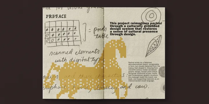
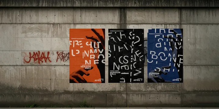
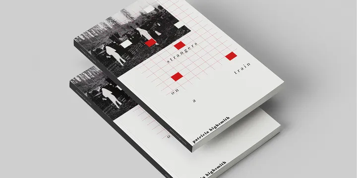
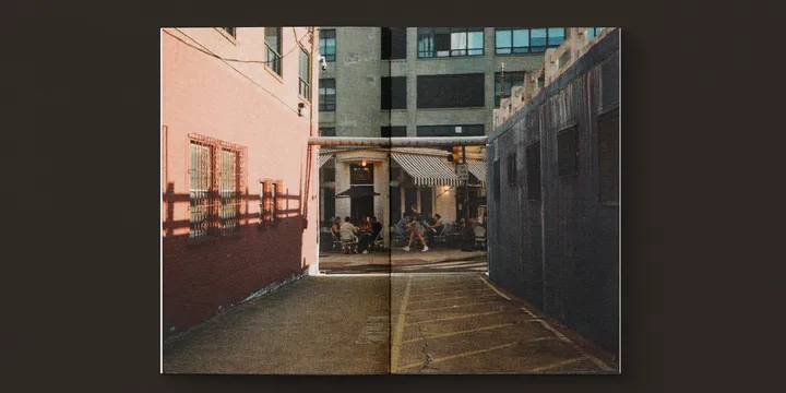
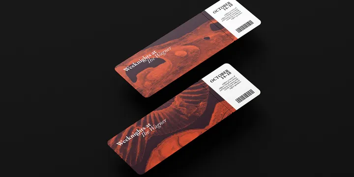
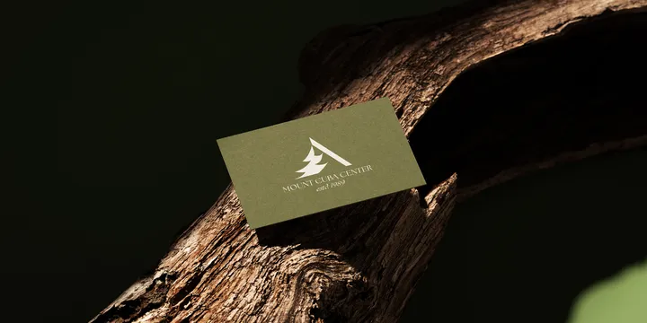
Created for my senior capstone, this project reimagines Pachisi, an ancient Indian race game, through a culturally grounded design system that restores a sense of cultural presence through design. Created for a typography project, this work includes three poster designs for Fire Shut Up in My Bones by Terence Blanchard, along with a leaflet mailer featuring a calendar of Ensemble Arts 2025 events. This project explores typography, composition, and visual hierarchy across both promotional and editorial formats. The three posters present distinct design approaches for interpreting the event’s themes, while the mailer extends the work into a structured print piece focused on information design and layout. This series of redesigned book covers reimagines three psychological thrillers by Patricia Highsmith—Strangers on a Train, The Talented Mr. Ripley, and The Price of Salt through a cohesive visual language centered on tension, identity, and psychological duality. The goal was to create a unified set that feels distinct yet interconnected, echoing the shared psychological intensity across the three novels. This project is a visual response to Letters to a Young Poet by Rainer Maria Rilke, using 35mm imagery taken over recent years, textures, and hand-drawn elements. The design translates the emotional and philosophical themes of the text into a visual language. The Wagner, created for a branding class, reimagines the identity of the Wagner Free Institute of Science. The goal of the project was to give the museum a more modern and approachable visual identity. The design combines contemporary layout choices along with a bold color palette that reflects a little bit of the museum's Victorian-era atmosphere and natural history collections. Visual identity for Mt. Cuba Center that reflects its mission as a native plant garden and conservation institution. The logo system draws inspiration from the organic forms, textures, and structures found throughout the landscape. By balancing natural elegance with clarity and structure, the identity is designed to feel both educational and inviting, appealing to visitors, researchers, and the broader community. The final mark is adaptable across print and digital applications, ensuring consistency while celebrating the Center’s connection to nature.