

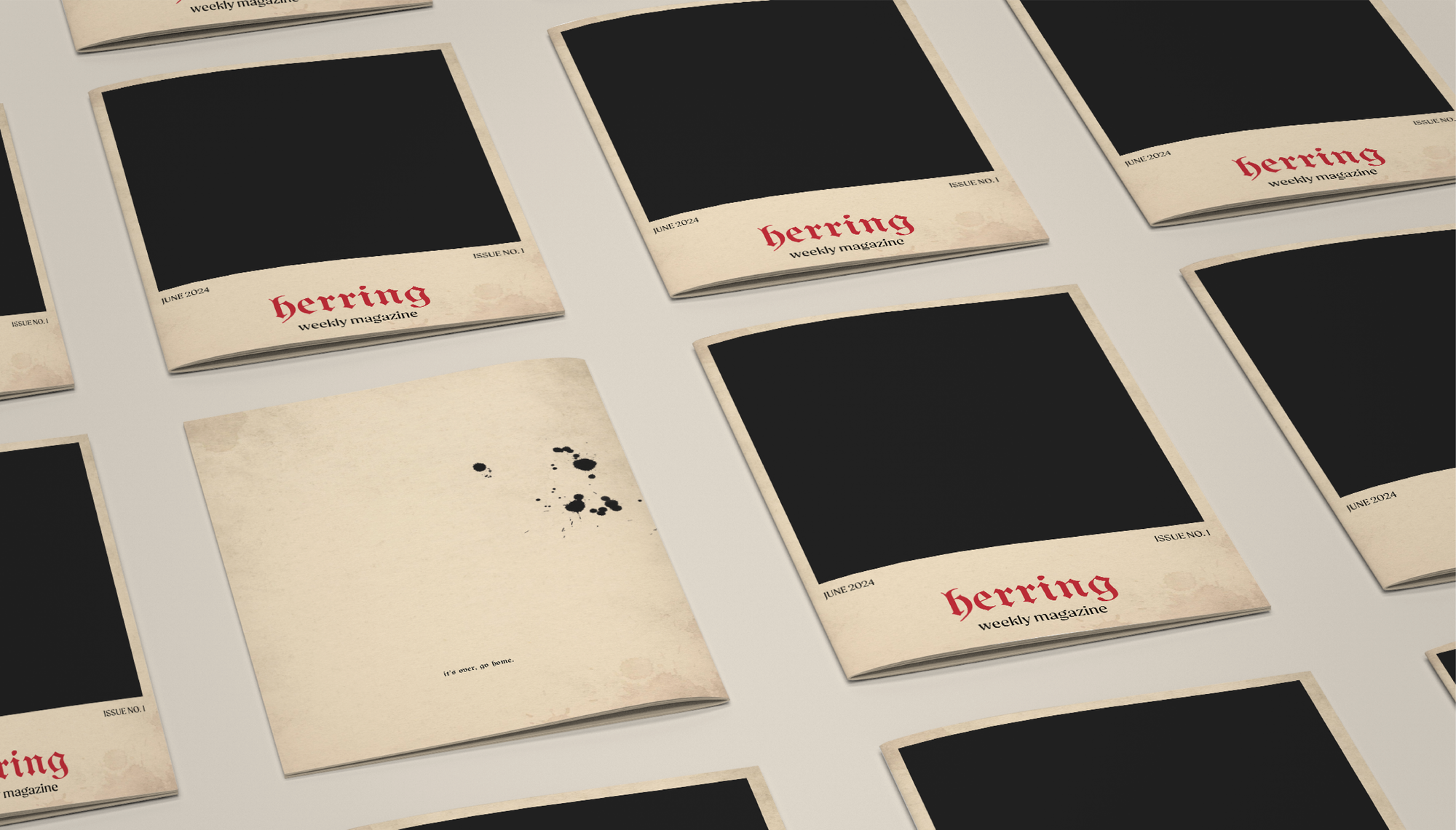
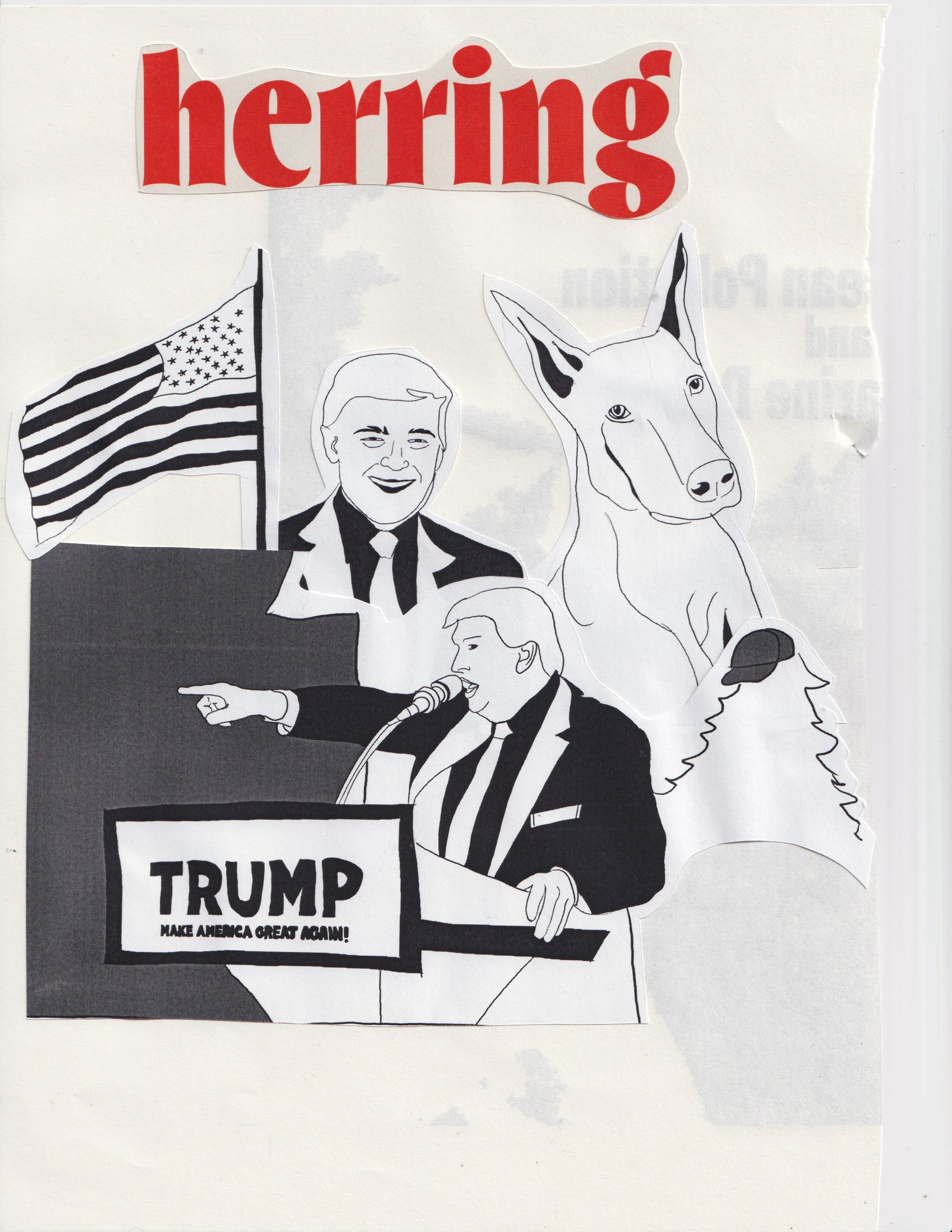
Herring-Weekly Magazine
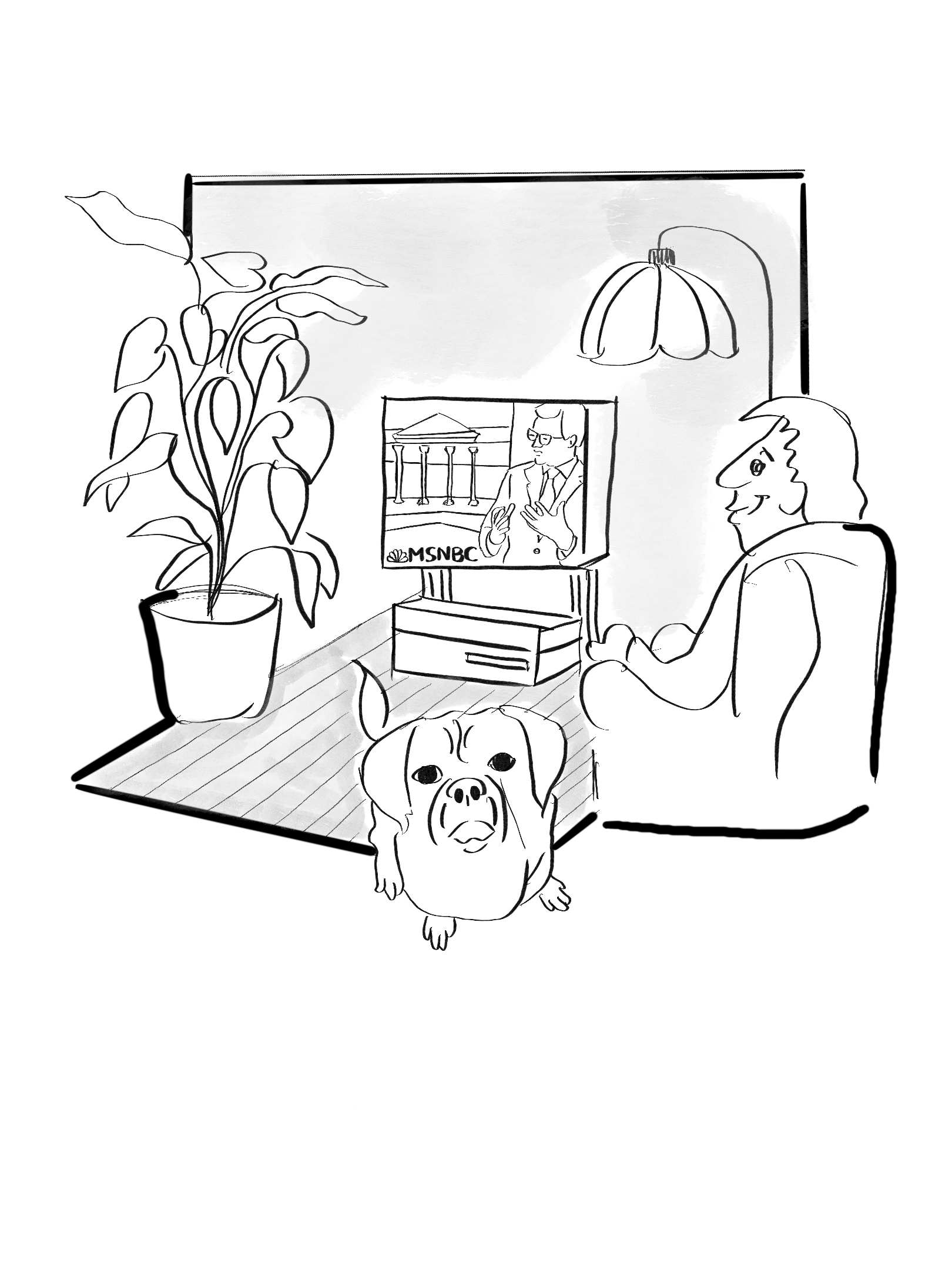
Herring is a humor magazine that uses satire as its primary comedic tool to comment on and critique various aspects of society, culture, politics, and current events.
Project Objectives
- Establish a cohesive visual identity for the magazine that reflects its tone, style, and brand image.
- Create compelling editorial content and visually captivating layouts to capture and maintain readers' attention throughout the magazine.
- Use editorial content and art direction to reinforce the magazine's brand values, messaging, and positioning in the market.


spreads
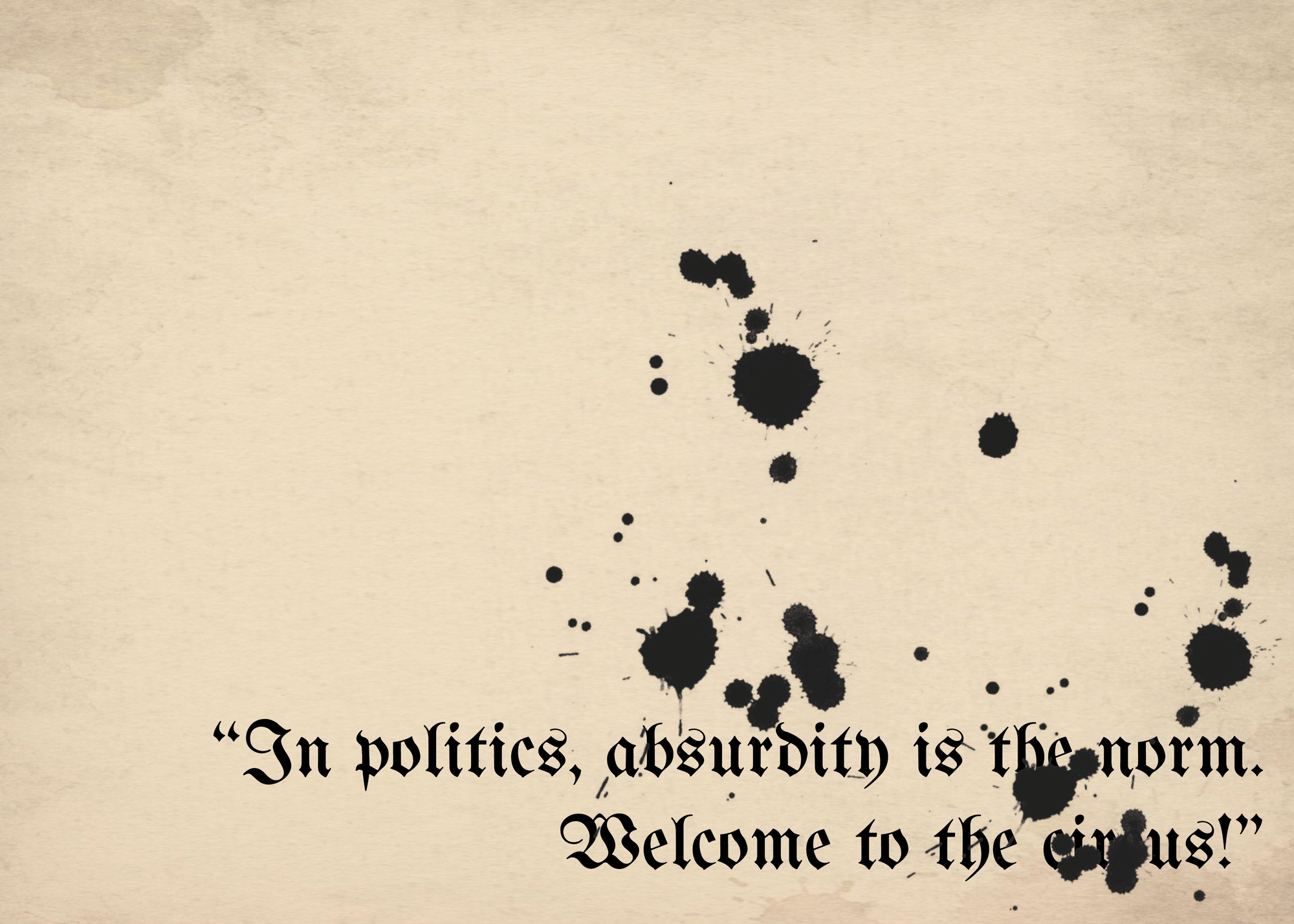
Why "Herring"?
"red herring" is a literary device or rhetorical strategy used to mislead or distract the audience from the true issue or focus of discussion. In the context of the humor magazine, "herring" is used metaphorically to represent elements of humor that are unexpected, unconventional, or offbeat.
Inspiration
Visual Dialogue was mostly inspired by propaganda art, contemporary art, and magazines like Simplicissimus, MAD Magazine, and The New Yorker which hold distinctive places in the realm of magazines, reflecting unique cultural perspectives, humor styles, and journalistic approaches.


covers
Creative Process


Process