
Project 1: Poster Series
To create a cohesive whole, I tried to employ comparable typefaces, styles, and primary element placements in each of the three posters in this series. When I first composed "Making it Up," I tried experimenting with scaffolding using the title as my inspiration. The negative space on these posters added to the overall coherence as well. I italicized the lines from the body copy to mimic quotes on book covers and used them to create a stair/book cover composition for "Myths, Legends, and Fantasy." The text also pierced through the "constructions" and into the negative space. I utilized a texture and wavy text for "The Forever Wave," while keeping the blocky design I used for all my posters.


Philadelphia Fringe Festival Poster Series
Project 2: Booklet Design


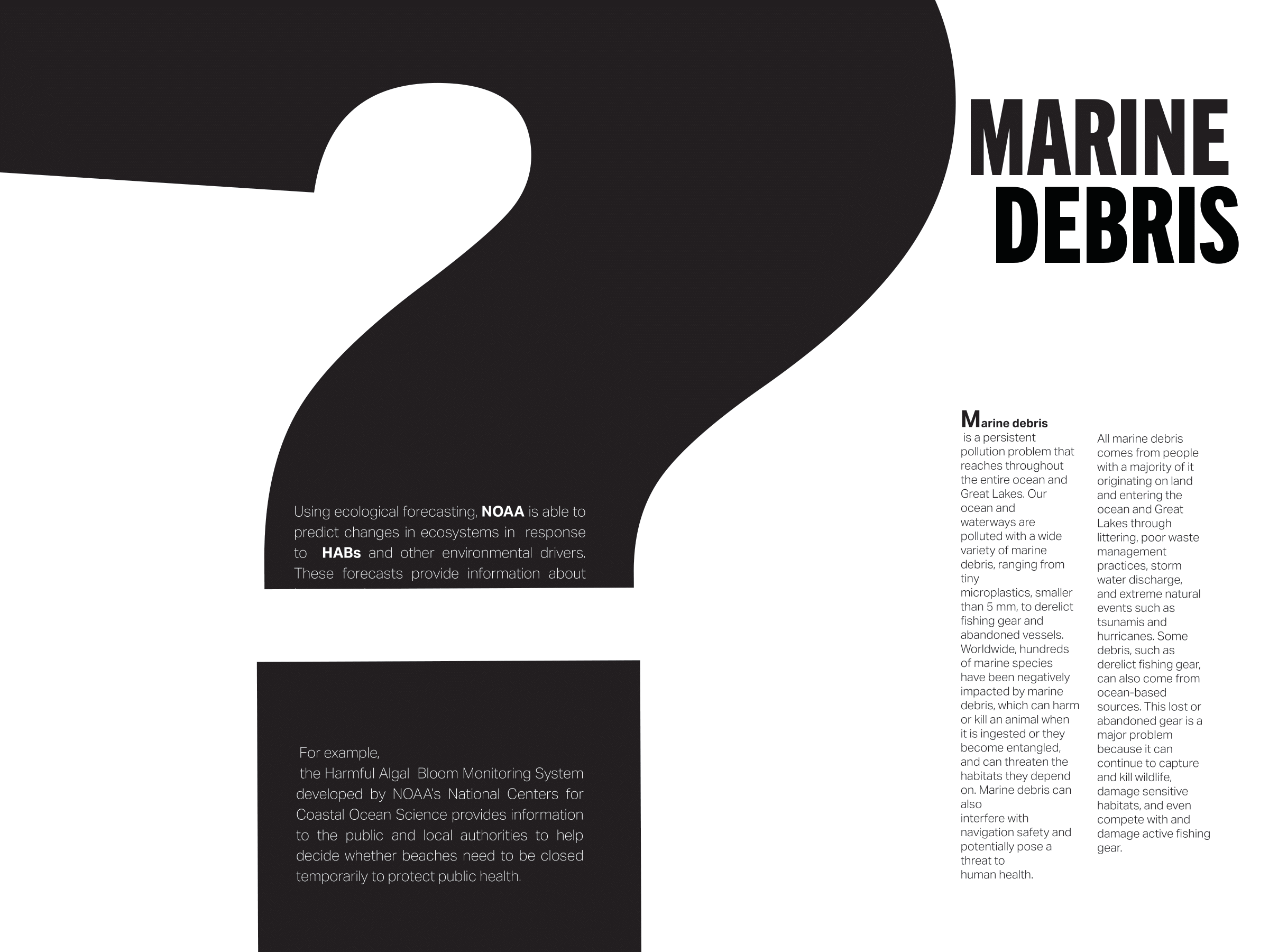

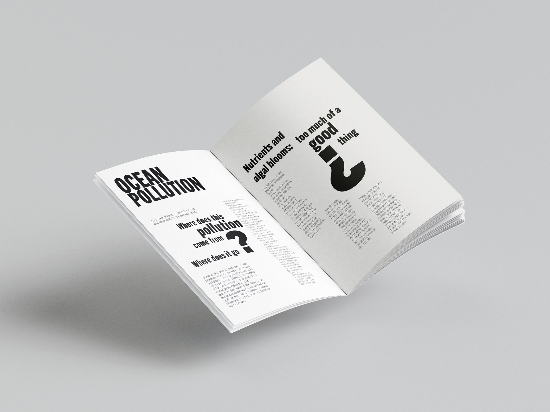
Booklet Spreads
Project 3: Calender Events Poster
For this project, I intended to focus on fitting all 13 events by developing a system for the assignment and highlighting the event hierarchy. I started by contemplating ideas and grid systems for the poster. Placing text while allowing enough negative space and breathing room was my top priority. The initial idea was to use a sticky note system and then align it to the grid but as I kept editing the events, they started to take form on the poster and looked more cohesive with the title I placed earlier as a placeholder. One of the biggest challenges working with a large serif font but I played around with the title and cropped a few letters, and I used the 'l' in 'talk' as a column to highlight the 'Free Library of Philadelphia' to break the space and add a structural element to the poster.
