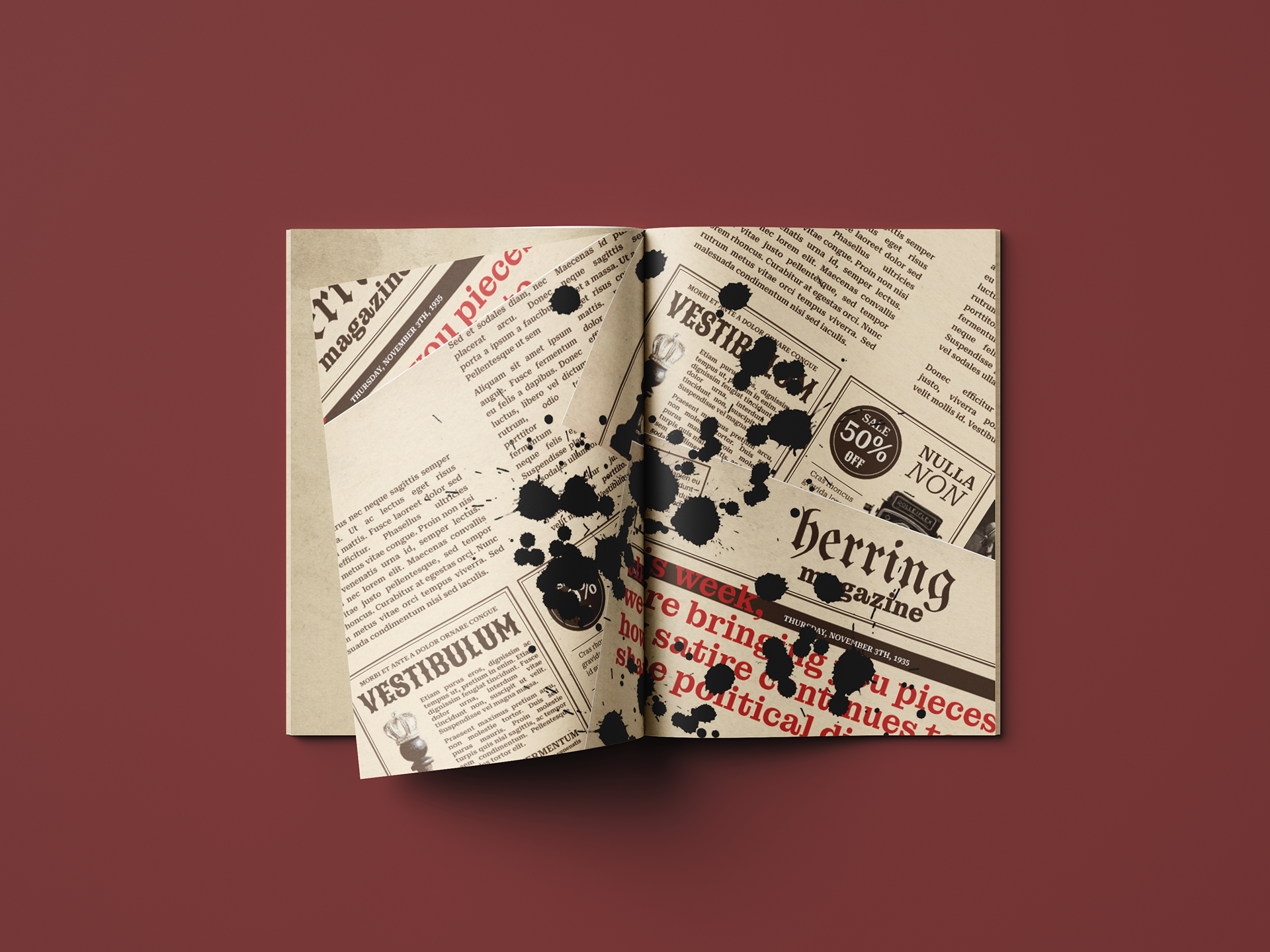
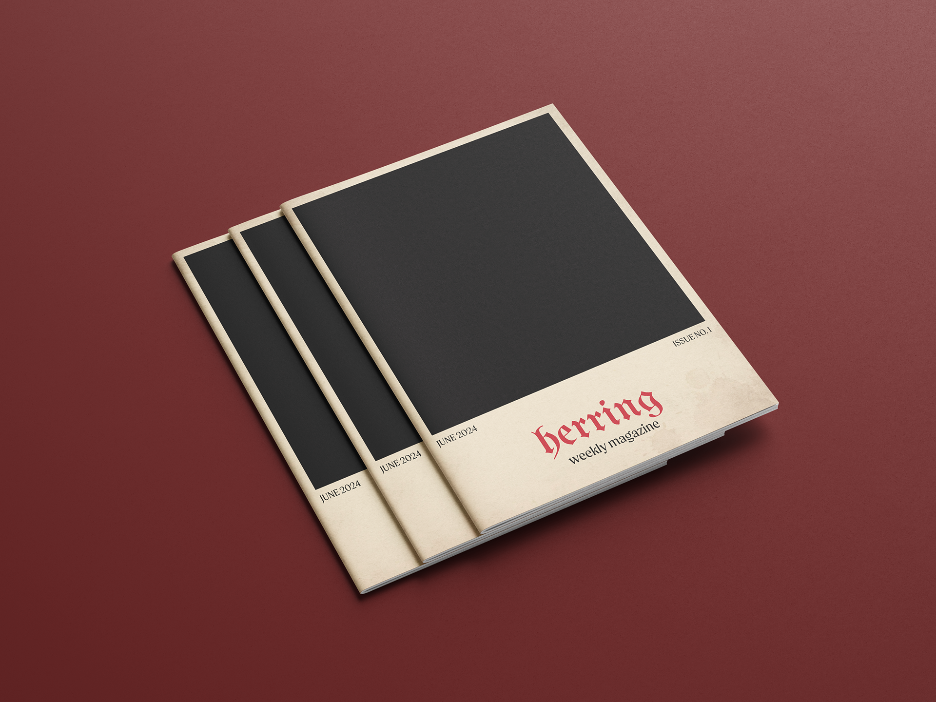
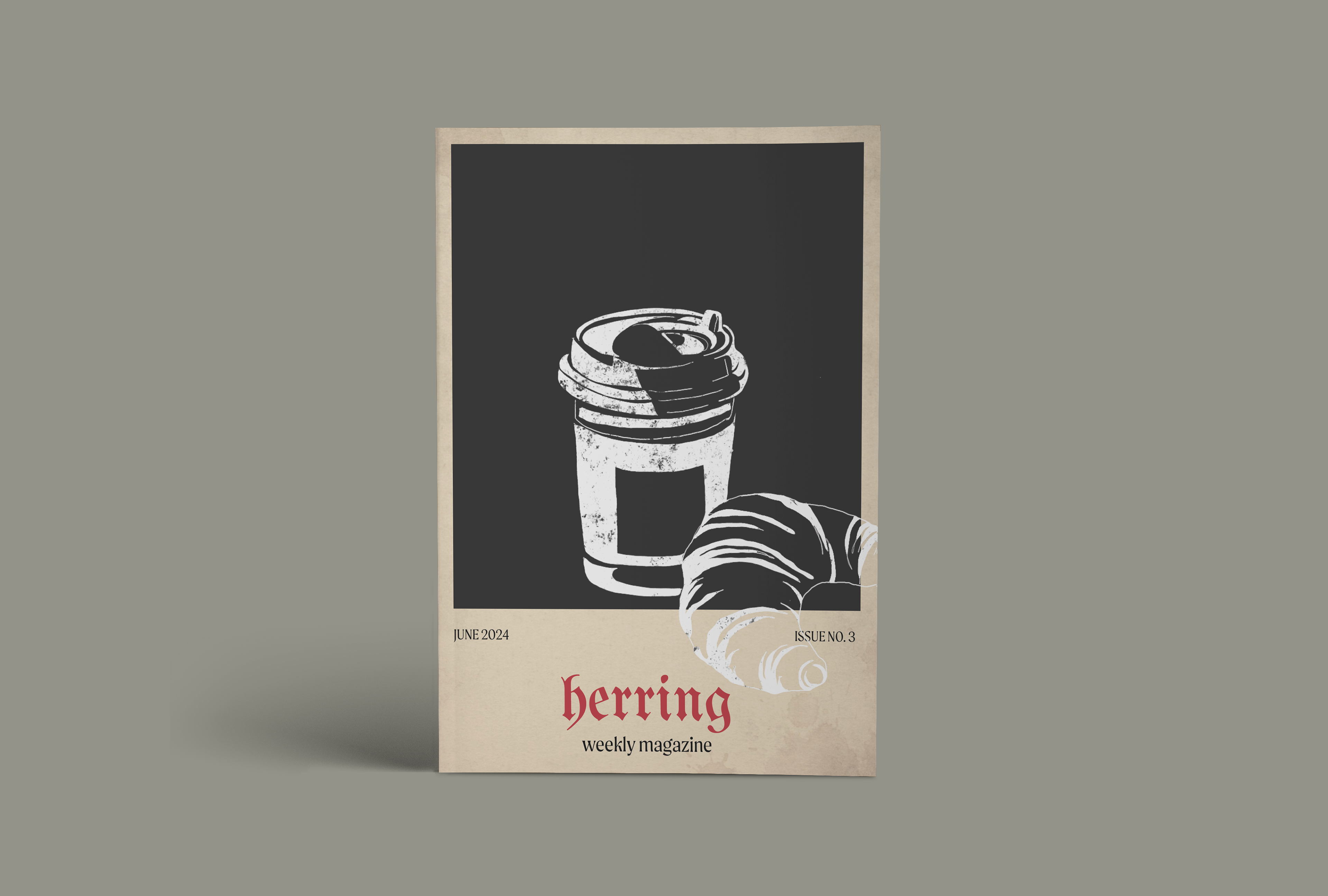
Herring is a weekly magazine that delivers satirical takes on current events, trends, and social issues, offering readers a fresh perspective on the often chaotic world around them.
Why "Herring"?
The magazine takes its name from the classic "red herring" — a metaphor for distraction or misdirection — because it pokes fun at the diversions that keep society entertained, while slyly reminding readers not to take everything at face value.

Editorial
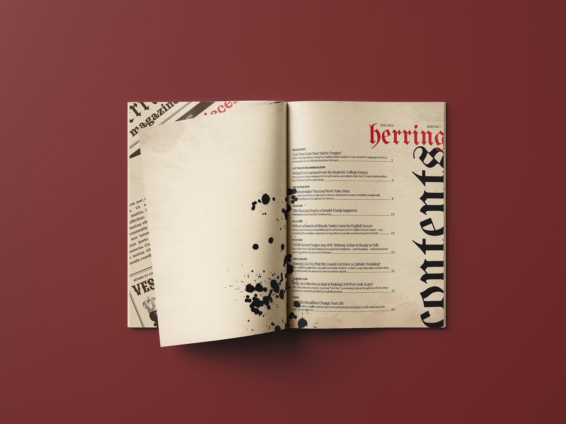
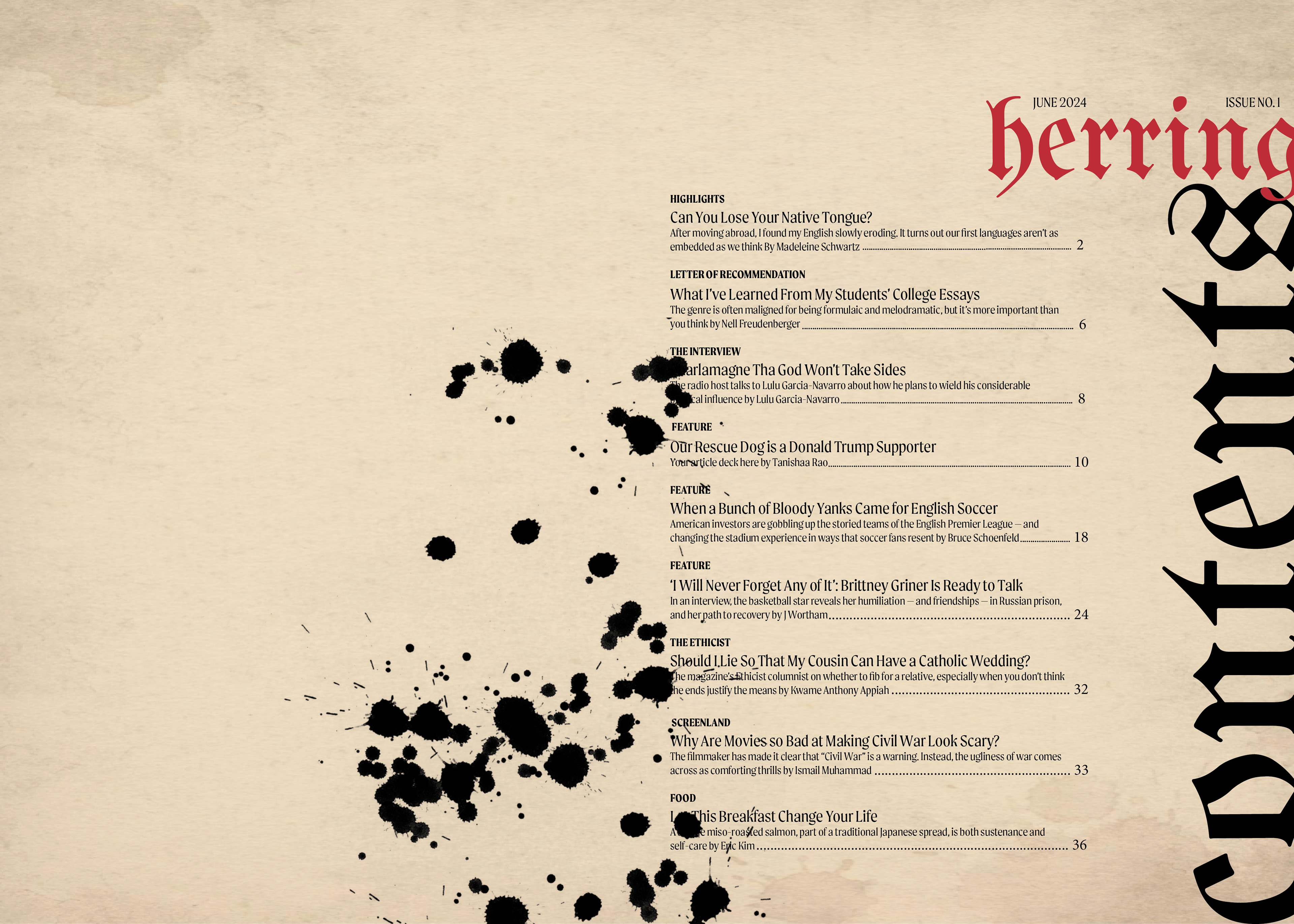
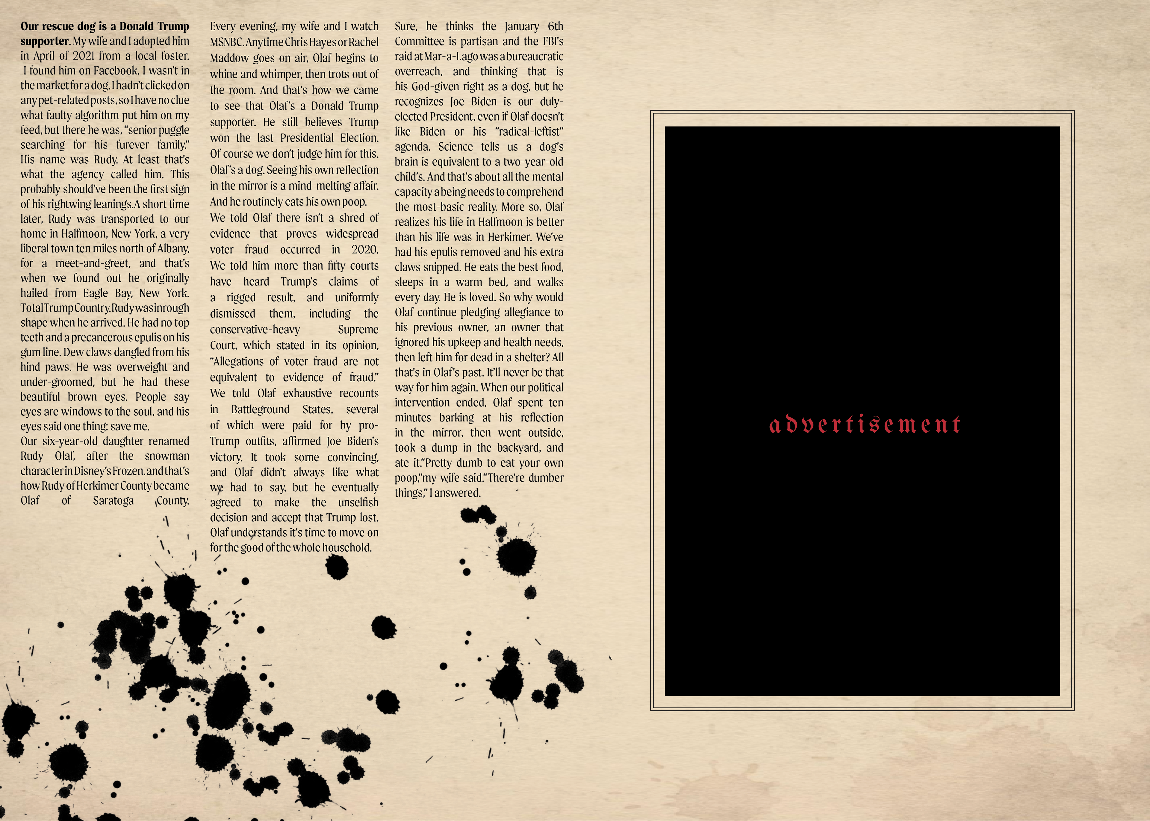
Despite the irreverence in tone, Herring maintains clear readability and ease of navigation. Editorial sections are well-structured, with thoughtful pacing that keeps the reader moving from one piece to the next. Article Used for Editorial.


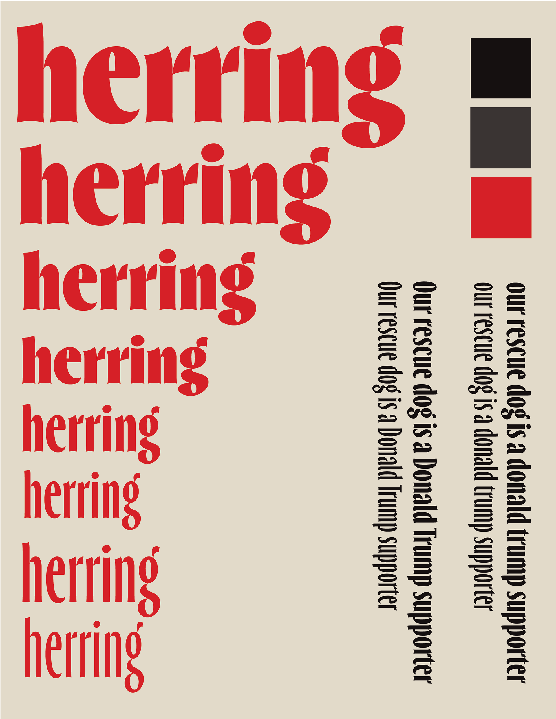
Visual Identity
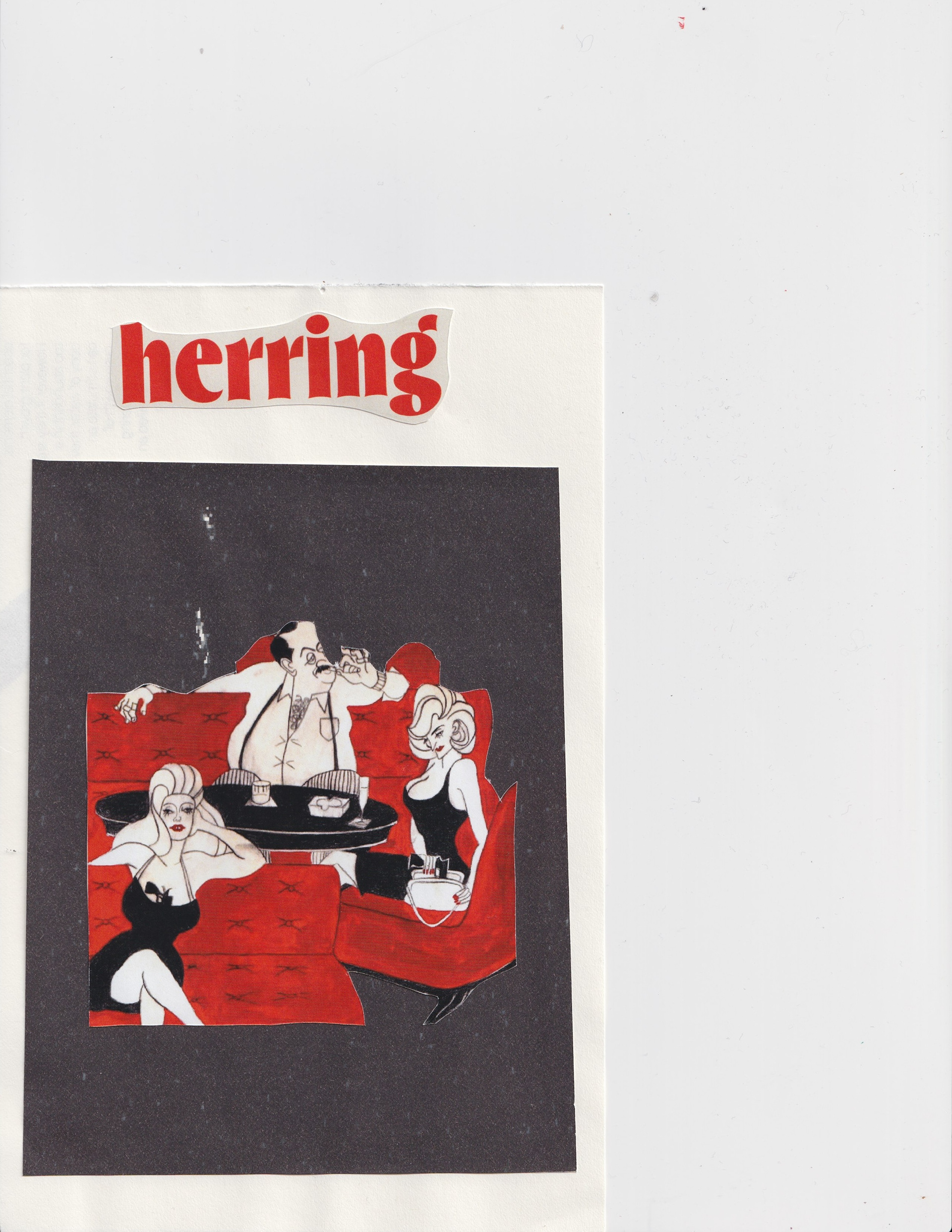
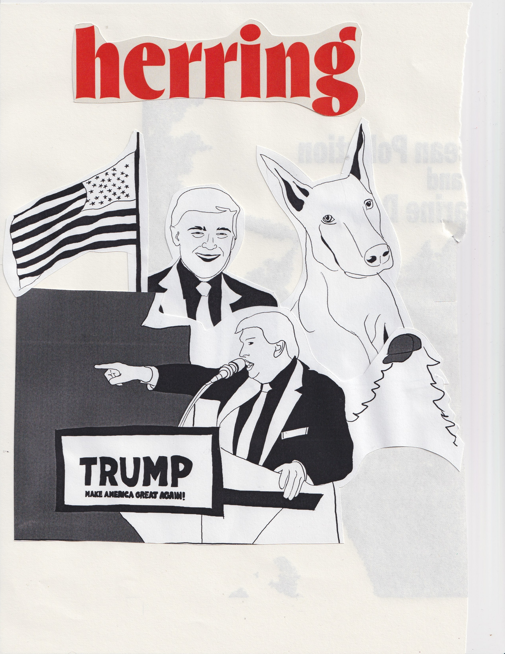
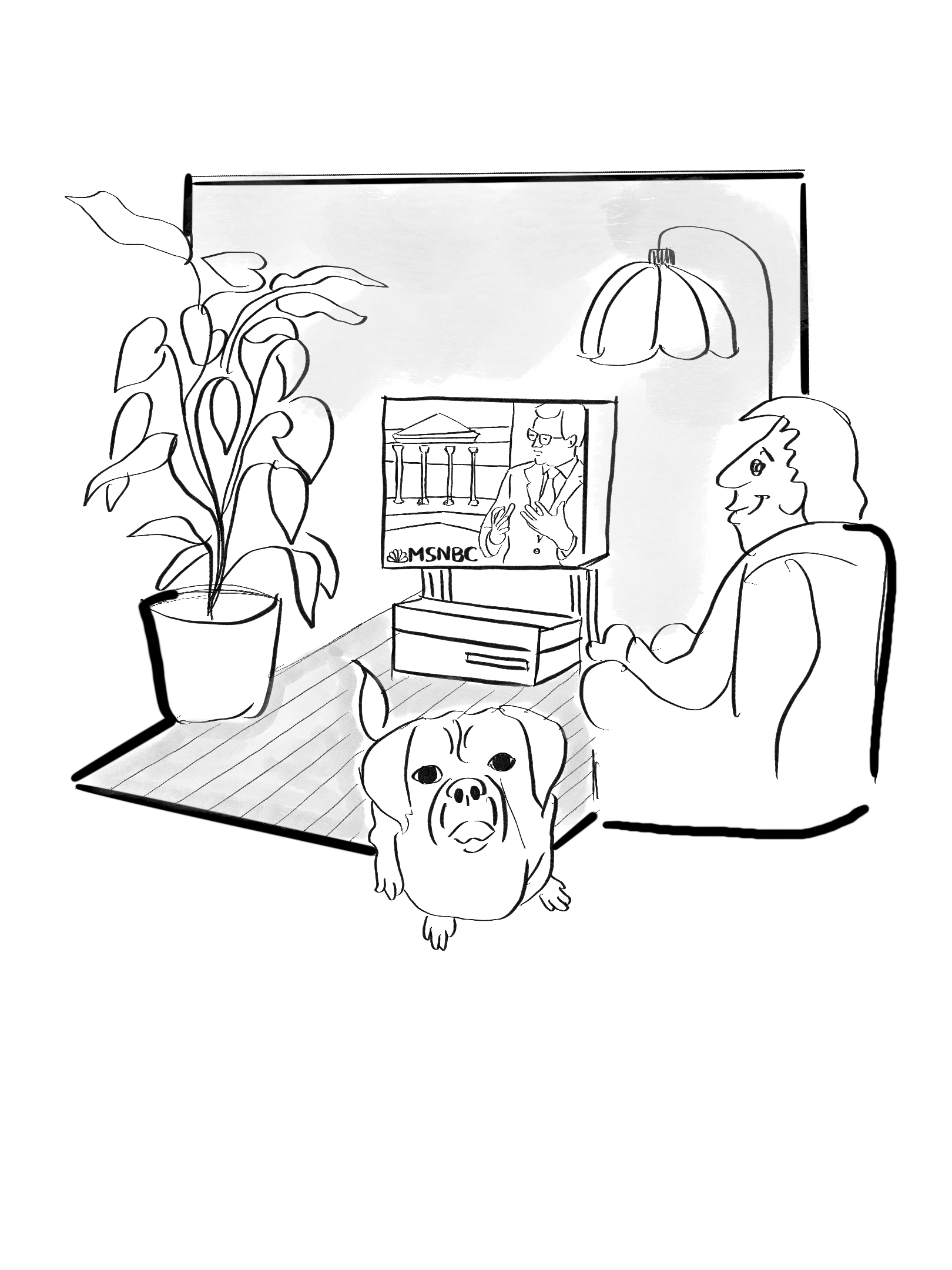
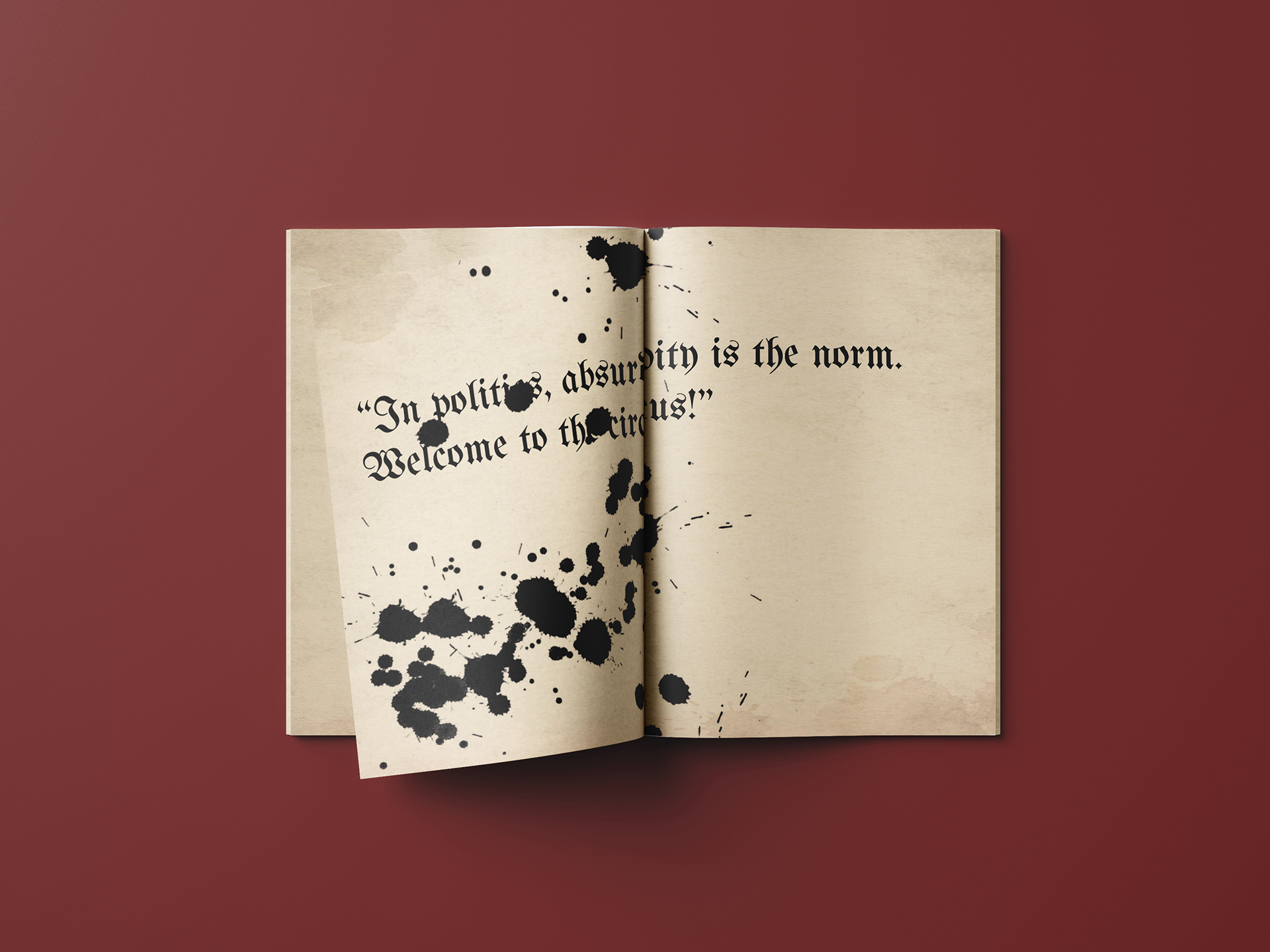
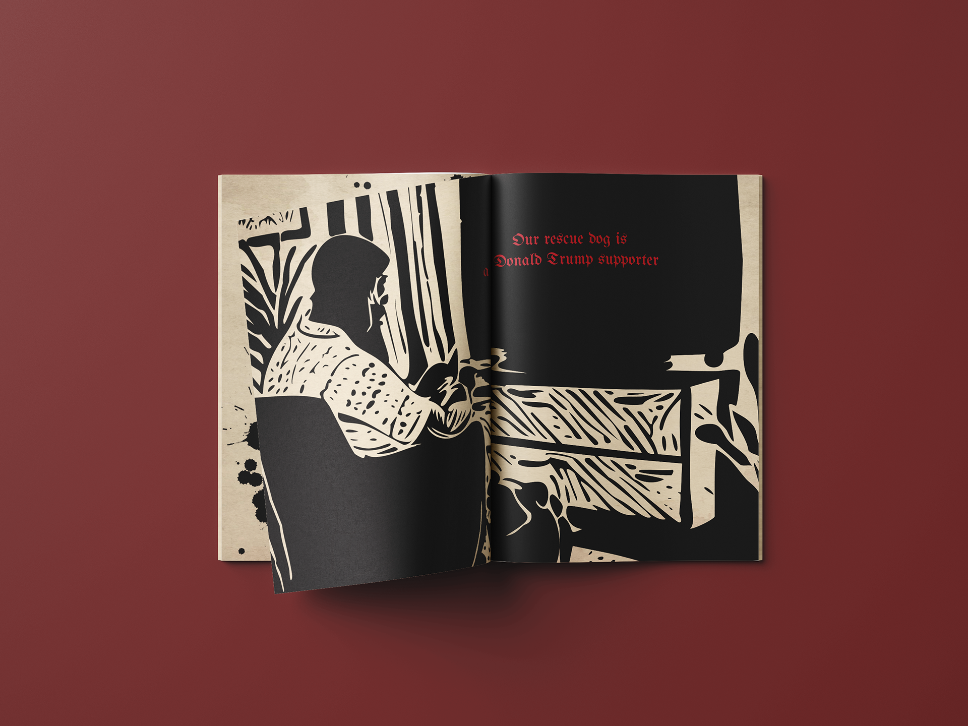
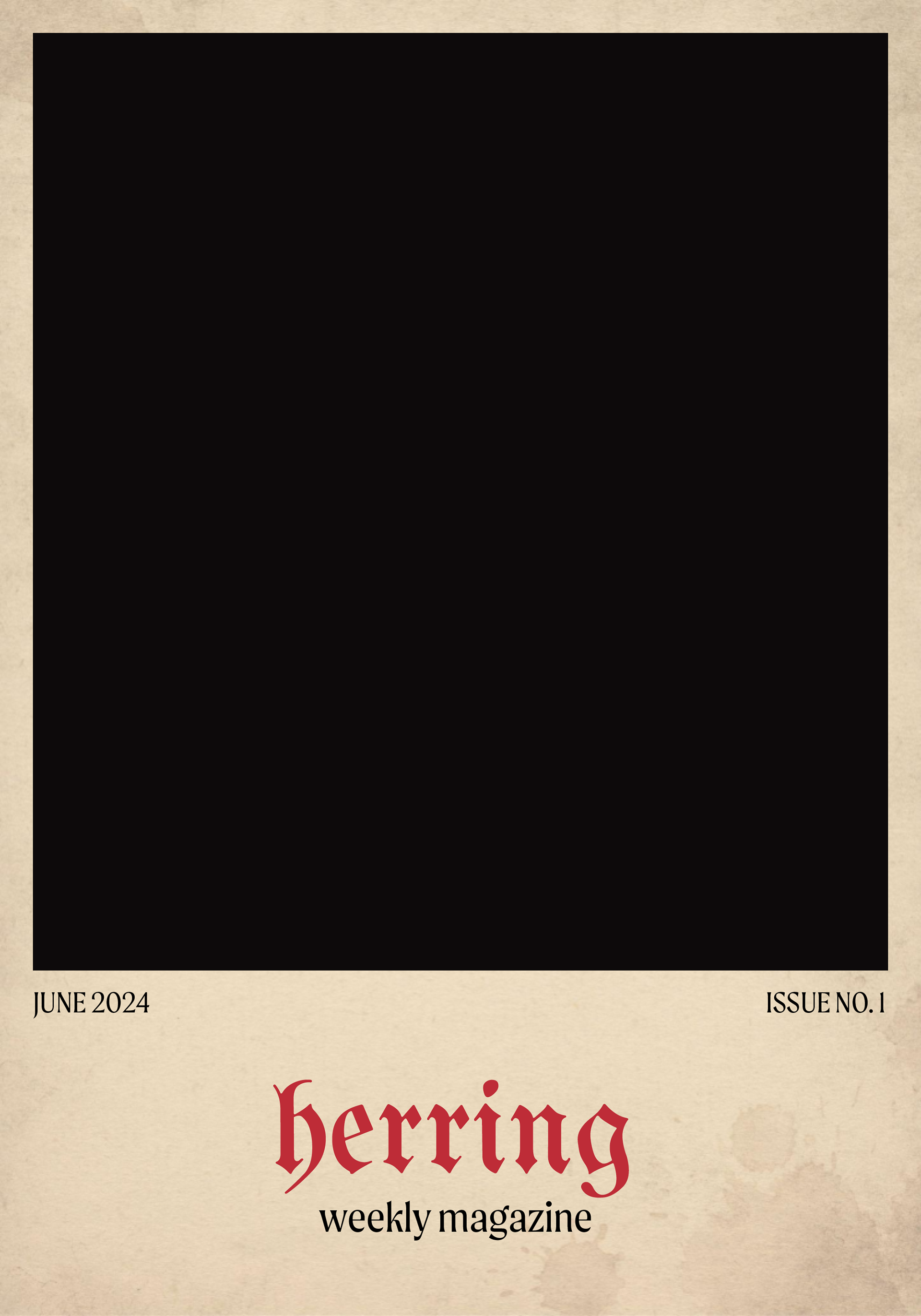
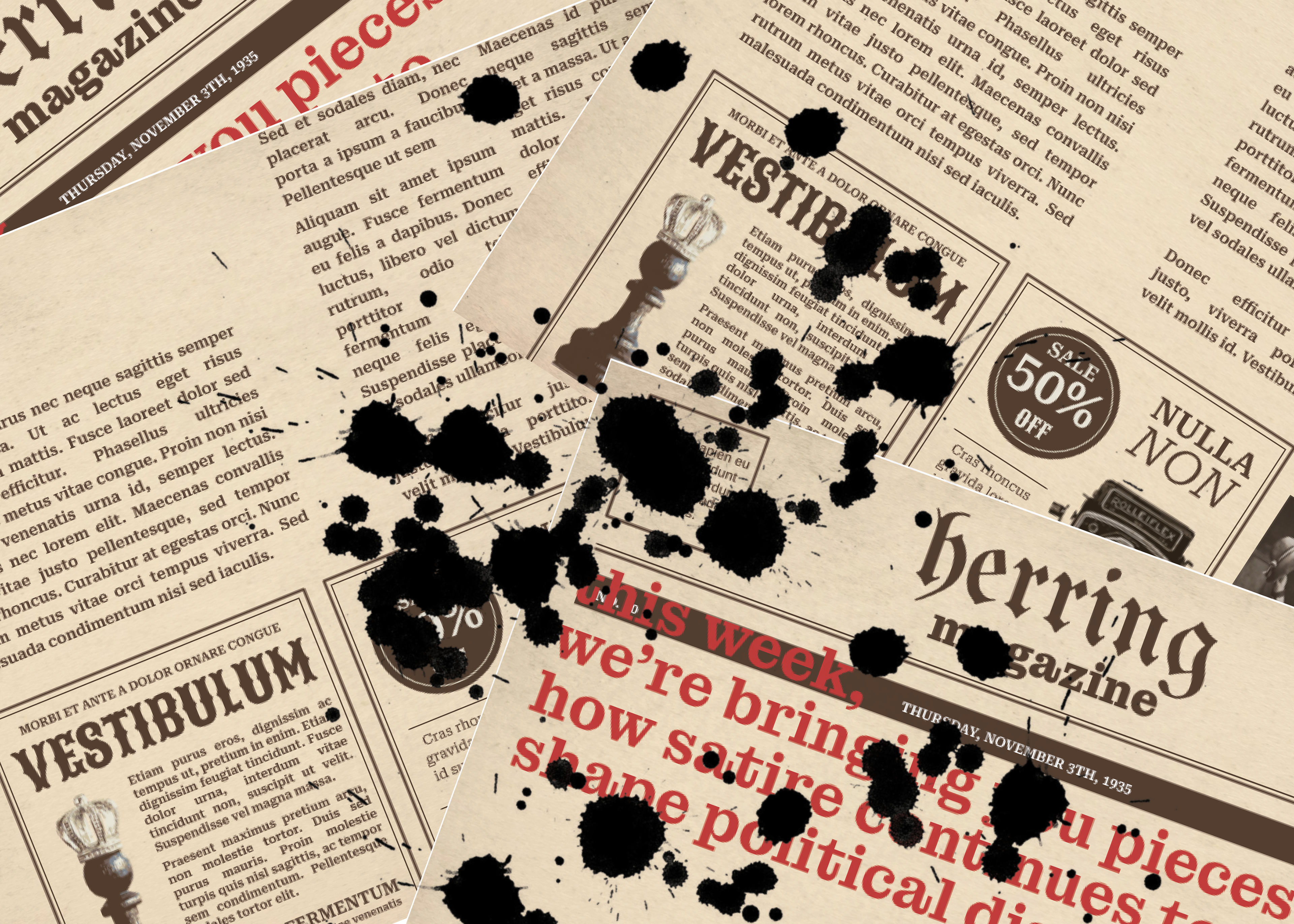
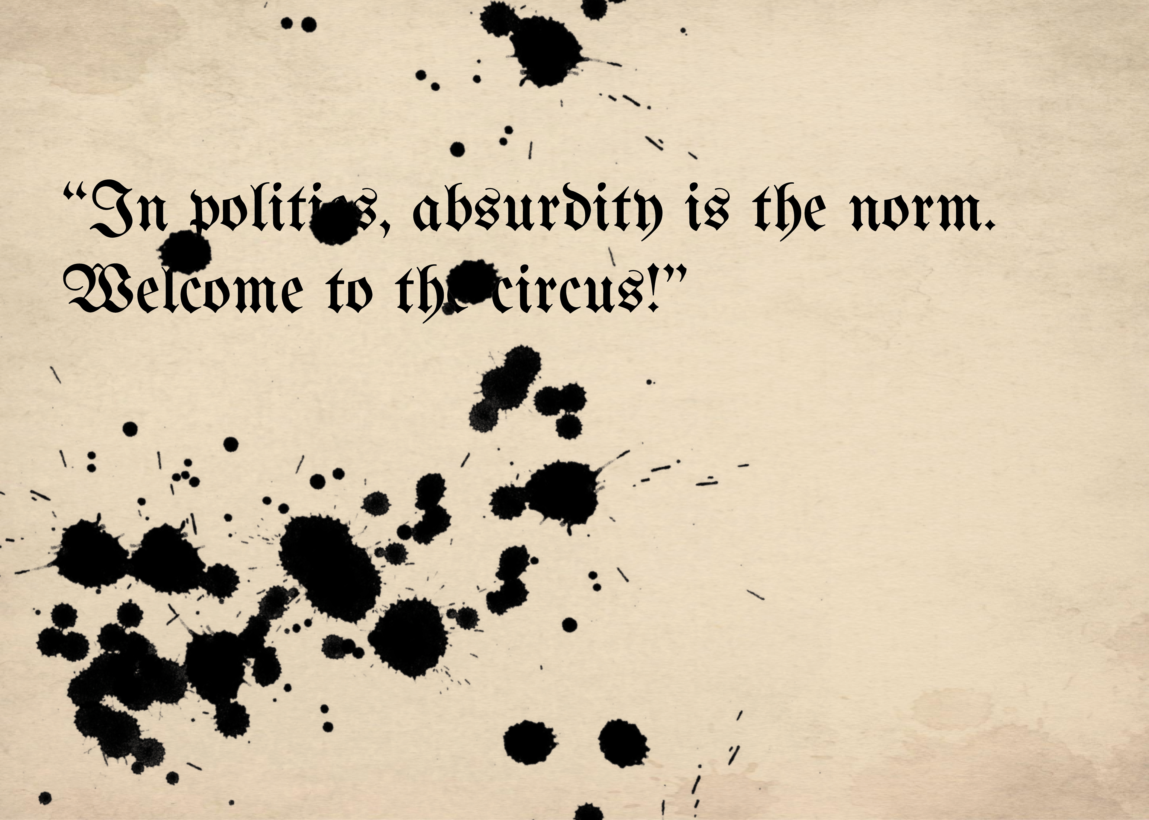
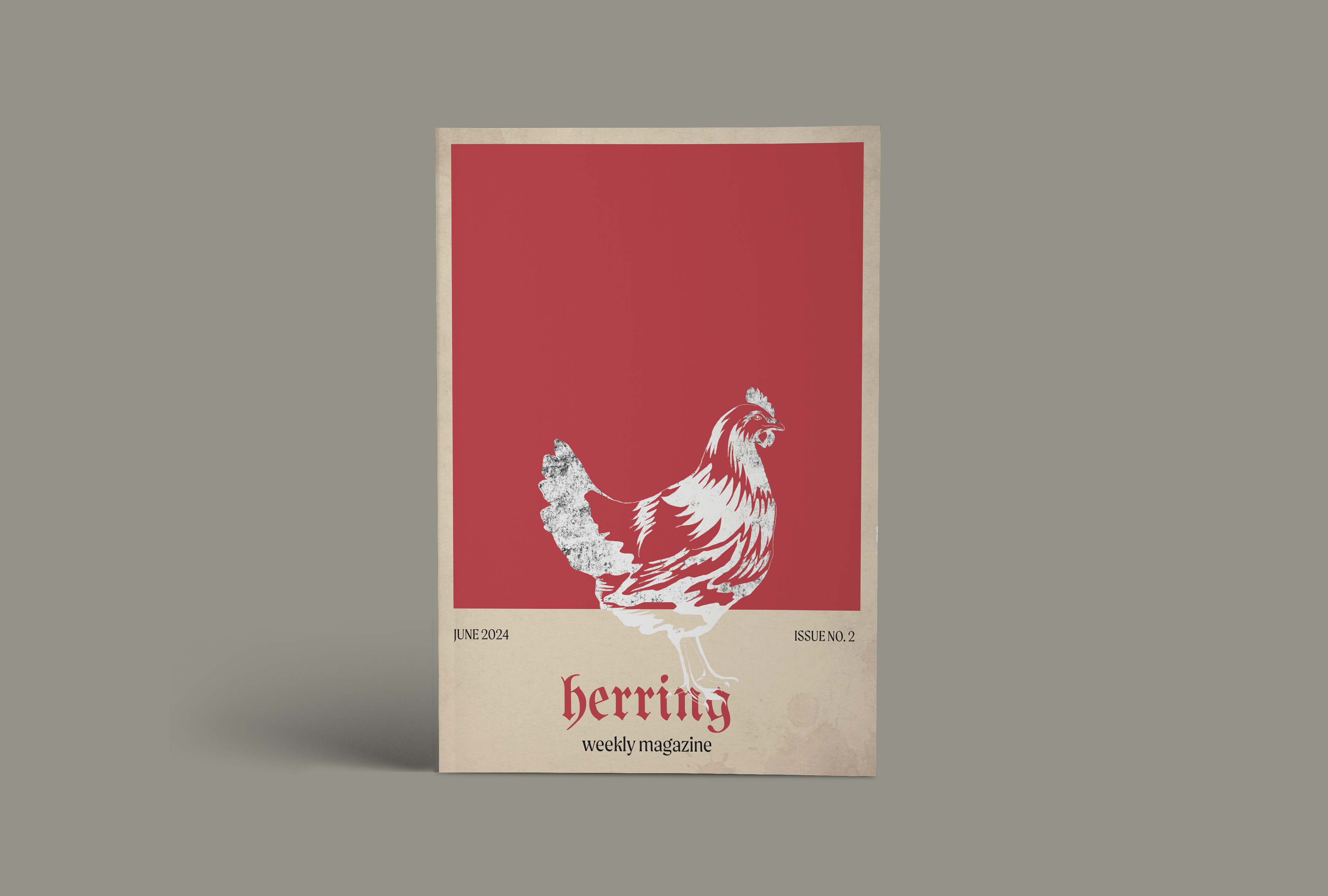
Captures the satirical tone through unconventional layouts and striking lino print illustrations. Inspired by magazines like Simplicissimus, MAD magazine, and the New Yorker.
Cohesive but Dynamic
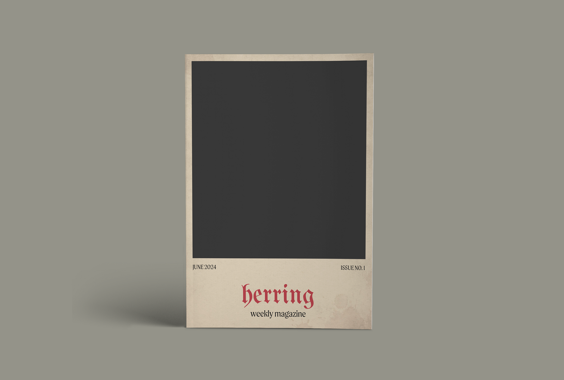
Consistent look that ties all elements together—reliable headers, section dividers, and style guides for recurring features—yet leaves room for dynamic experimentation.
Creative Process
